Posts

Final Portfolio

Image
Well we finally reached the end! This project was created in Adobe InDesign compiling all of the projects that we created this semester. I chose to create a beachy vibe because I grew up near the water my entire life.  I enjoyed this class at times and also hated it at times but it taught me lots of skills that I will use later on in life. I am very satisfied with the content I created and  can see how much I learned by going through my presentation! Thank you Dr.Roundtree!

BUSINESS CARDS

Image
For this project, we created business cards using Adobe InDesign. I found this project to be a little complex as I have never used the software before. I created three designs that I believe show creativity and professionalism. The hardest part of this project was figuring out how to add my logo since you can't drag it in like in Photoshop or Illustrator. Each business card features my logo, along with my name, phone number, and email address.  Estimated time: 2 hours  

BUSINESS CARD IDEAS

Image
  Here are my first draft sketches of the ideas for the business card I will create using Indesign. I created three different cards (front on left, back on right). For each design, I chose to keep a simple font featuring my logo, my name, and my major. Our of all of the sketches, I like the one design featuring my headshot. I believe each design is professional and can relate to the business I plan on working with in the future. 

Somewhere

Image
      For this project, I had to photoshop myself into a scene of movie. I chose Home Alone and picked the scene where Kevin ask for help from Donald Trump. I added myself into the frame to make it look like I'm trying to help him by keeping him away from him.  This project involved masking, working with adjustment layers and acting out an image to execute the photoshop. I took the image of me at work, and had my coworker act out as the boy so I could cut out my body and hand to add to the movie scene. After adding myself in, I adjusted the Hue/Saturation to make my skin tone match.  I found this project to be easy and fun. It took me under an hour to create my scene. Below you can find my original images.  

Pre Somewhere

Image
I believe that this image would be hard to photoshop myself in because of  the light beams and city lights that look like they would be hard to match with. Plus there is an illusion of speed going on that I believe I would mess up. This gives me an idea that I want to make a project from a movie scene and flip it around to make it funny. There are many parodies created but this one seems to be the best. The irony in this photo is that Trump is photoshopped as Godzilla and is destroying the county.  This image made me laugh because the editor added in an actually ass instead of photoshopping the girls butt. He wasn't wrong though and technically did what she told.  I found this illusion to be cool because it gives the idea of a couple being together in photo frames. There is so much you can do with this idea with adjustment layers and if I were to do it, I would edit the color and create a different setting in each frame.   

Tag Brush

Image
  My tag brush was created in Adobe Photoshop. For my tag brush, I applied they spray2 overlay and a scratch filter to create the brush. In the brush, you can clearly see my logo in a grayscale format but I am able to change the color by editing the brush. I will be using this tag brush for future projects to copyright them as mine. This project was pretty easy for me. I never created a brush in Adobe Photoshop but by following the instructions on the pdf, I was able to complete this brush in less than 10 minutes. The process was quick and simple!

Autoscopy

Image
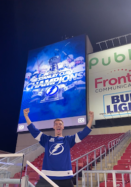
                For my Autoscopy project, I decided to alter a picture of me at the Tampa Bay Lightning celebration. One thing that I never knew about myself was how big of a fan I am for this team once we won the championship. To express my fandom, I edited face paint on my face with an adjustment layer and playing with the opacity. I also wanted to make the photo more dramatic by adding a storm of lightning and rain.  Followed by a picture of the stanley cup in the clouds. I also wanted to add fans from a game and place them in all the empty seats to enhance the photo.  Overall, I found this project to be fun and creative. It helped me gain a better understanding of layers and adjustment layers in Adobe Photoshop.  Estimated Time: 1 1/2 Hours