Posts

Final Portfolio

Image
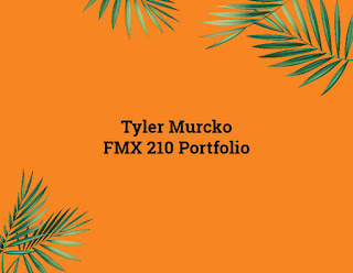
Well we finally reached the end! This project was created in Adobe InDesign compiling all of the projects that we created this semester. I chose to create a beachy vibe because I grew up near the water my entire life.  I enjoyed this class at times and also hated it at times but it taught me lots of skills that I will use later on in life. I am very satisfied with the content I created and  can see how much I learned by going through my presentation! Thank you Dr.Roundtree!

BUSINESS CARDS

Image
For this project, we created business cards using Adobe InDesign. I found this project to be a little complex as I have never used the software before. I created three designs that I believe show creativity and professionalism. The hardest part of this project was figuring out how to add my logo since you can't drag it in like in Photoshop or Illustrator. Each business card features my logo, along with my name, phone number, and email address.  Estimated time: 2 hours  

BUSINESS CARD IDEAS

Image
  Here are my first draft sketches of the ideas for the business card I will create using Indesign. I created three different cards (front on left, back on right). For each design, I chose to keep a simple font featuring my logo, my name, and my major. Our of all of the sketches, I like the one design featuring my headshot. I believe each design is professional and can relate to the business I plan on working with in the future. 

Somewhere

Image
      For this project, I had to photoshop myself into a scene of movie. I chose Home Alone and picked the scene where Kevin ask for help from Donald Trump. I added myself into the frame to make it look like I'm trying to help him by keeping him away from him.  This project involved masking, working with adjustment layers and acting out an image to execute the photoshop. I took the image of me at work, and had my coworker act out as the boy so I could cut out my body and hand to add to the movie scene. After adding myself in, I adjusted the Hue/Saturation to make my skin tone match.  I found this project to be easy and fun. It took me under an hour to create my scene. Below you can find my original images.  

Pre Somewhere

Image
I believe that this image would be hard to photoshop myself in because of  the light beams and city lights that look like they would be hard to match with. Plus there is an illusion of speed going on that I believe I would mess up. This gives me an idea that I want to make a project from a movie scene and flip it around to make it funny. There are many parodies created but this one seems to be the best. The irony in this photo is that Trump is photoshopped as Godzilla and is destroying the county.  This image made me laugh because the editor added in an actually ass instead of photoshopping the girls butt. He wasn't wrong though and technically did what she told.  I found this illusion to be cool because it gives the idea of a couple being together in photo frames. There is so much you can do with this idea with adjustment layers and if I were to do it, I would edit the color and create a different setting in each frame.   

Tag Brush

Image
  My tag brush was created in Adobe Photoshop. For my tag brush, I applied they spray2 overlay and a scratch filter to create the brush. In the brush, you can clearly see my logo in a grayscale format but I am able to change the color by editing the brush. I will be using this tag brush for future projects to copyright them as mine. This project was pretty easy for me. I never created a brush in Adobe Photoshop but by following the instructions on the pdf, I was able to complete this brush in less than 10 minutes. The process was quick and simple!

Autoscopy

Image
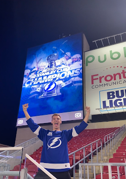
                For my Autoscopy project, I decided to alter a picture of me at the Tampa Bay Lightning celebration. One thing that I never knew about myself was how big of a fan I am for this team once we won the championship. To express my fandom, I edited face paint on my face with an adjustment layer and playing with the opacity. I also wanted to make the photo more dramatic by adding a storm of lightning and rain.  Followed by a picture of the stanley cup in the clouds. I also wanted to add fans from a game and place them in all the empty seats to enhance the photo.  Overall, I found this project to be fun and creative. It helped me gain a better understanding of layers and adjustment layers in Adobe Photoshop.  Estimated Time: 1 1/2 Hours 

Photoshop B&W to Color

Image
  In this project, we were able to use Adobe Color as a tool to edit our images in photoshop. I chose three color themes that seemed like good colors that would match well with each other to create a "pop art" vibe for my project. This project was much more complicated than it looked and took lots of time to fill the selections with different colors. Overall, this project took me some time but got easier as I got the hang of it. The three color themes I used were Self Complementary,Triad, and Analogous.  

Photoshop Tutorials

Image
  https://www.youtube.com/watch?v=sF_jSrBhdlg I chose this tutorial because it gives you a brief overview of Adobe Photoshop and what the software is for. The video explains the workspace, how to create a project, and how to export one. The use of pixels is mentioned in the tutorial and the guy mentions how they lose quality when you make an image bigger. Another important thing that was mentioned would be the layers and how they work. I believe that this tutorial is a good introduction for someone learning Adobe Photoshop. https://www.youtube.com/watch?v=Hw0-SehGcgg This tutorial focuses on cutting out an image and removing the background in Adobe Photoshop. It is simple, quick and goes over the process of using the pen tool to trim what you want to keep and delete.  Deleting a background can be really easy when you use the magnetic lasso tool combined with polygonal lasso tool and masks. The tutorial also talks about other options such as the selection tool and lasso tool. h...

Self Portrait Propaganda Poster

Image
  My self portrait poster was designed in Adobe Illustrator using vector shapes. For this design , I decided to do my poster theme on wearing mask. There is enough evidence that they work and stop the spread of Covid-19 but people still get political with wearing them. I am really shocked at how nice my poster turned out. This was my first time creating a face on any editing software and I thought I wouldn't succeed due to the complications of shading. I went over my face in Illustrator with the pen tool to create the basic shapes of my face, then proceeded to fill the shapes with the same color of my skin using the eyedropper tool.  The design itself is put together in a way that makes it art while sending an important message. Overall, I am very happy with my image and how it came out. If I had to change one thing, it would be my hair. I couldn't find an effect to add my highlights. Estimated work time: 4 hours

Logo

Image
  For my Logo project, I decided to vectorize a sketch inspired by my passionate moodboard. This work is made up of vector shapes and was designed in Adobe Illustrator. The logo features a man throwing his fist up in the air to show how passionate he is to work, followed by his head being a heart (which symbolizes his love for the job). I thought this logo was executed quite well because it blends passion with professionalism in a simple design.  The main tools that I used to create this design were the selection tool, direct selection tool, curvature tool and the ellipse tool. I was planning on making the logo sharp and later found out that the rounded corners in the suit looked more fun when I accidentally used the curvature instead of the pen tool. I believe the hardest part of this project was creating the heart, I had to look up a tutorial to create the shape since there aren't any tools allow you to. The heart is made up of two rounded rectangles that later angled t...

Calligram Project

Image
      For my Calligram project, I decided to replicate captain Steven Stamkos of the Tampa Bay Lightning lifting the Stanley Cup. This work is made up of vector text and was designed in Adobe Illustrator. For my first attempt in Adobe Illustrator, I am very pleased with my work. With being proficient in Adobe Photoshop, this project allowed to me to see how both the applications compare and contrast.    The cup was created with names of the players that won the championship this year followed by the hockey player being created out of my personal letter to my future self 20 years from now. I wanted the story to match the imaged so I wrote about how life was like a hockey game and how it will have ups and downs just like this the season the team faced with the pandemic. I believe the only difficult thing about creating my calligram was the time it took to add and edit the text to fit the image.  Estimated  work time: 5 1/2 Hours Inspiration:

Illustrator Tutorials

Image
  https://www.youtube.com/watch?v=M5jOg2iDPeM In this 3 minute tutorial, this man goes over the basics of Adobe Illustrator to create vector graphics. . A vector is an object that has both a magnitude and a direction. Geometrically, we can picture a  vector  as a directed line segment, whose length is the magnitude of the  vector  and with an arrow indicating the direction. A vector can be scaled to any size without a loss in quality. He goes over on how to start a new file and mentions how RGB Color mode is suitable for graphics on screens while CMYK is suitable for graphics on print. He goes over the basics for tools and I thought this would be a good tutorial to start with so It can peak my interest on specific tools. https://www.youtube.com/watch?v=cik1Ed9gzLE Assuming that we will be creating graphics similar to what we accomplished in Adobe Dreamweaver, I thought it would be a good idea to learn more about the pen tool. In this tutorial, they mention ...

Canvas

Image
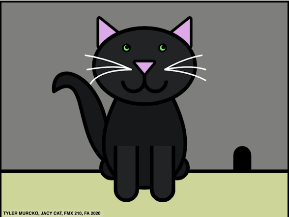
  This work was designed in Adobe Dreamweaver using HTML Canvas to create digital art out of code. For this design , you can see that the cat is made from several shapes and curves. There are even more shapes that are hidden to fill certain gaps that showed up throughout my project. I started this project with something more complicated and decided to create something more simple after seeing other student projects. Over the course of creating my image, I came to a point where I had to stop coding and come back later because I was having a difficult time lining up my points correctly. I learned that editing in Adobe Dreamweaver is a very long, complicated, process that takes lots of time and patience.   The design itself is very personal to me because I got the inspiration to create this image from my pet cat. The title is named after her and I’ve attached a picture below of her for comparison.   Overall, I am very happy with my image and how it came out. Symmetry is what...